Changing the spare room into a stylish office

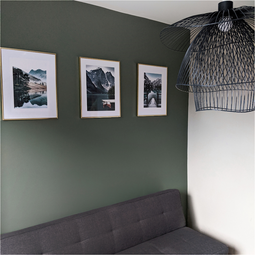
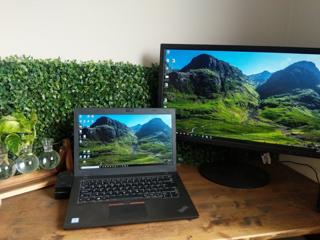
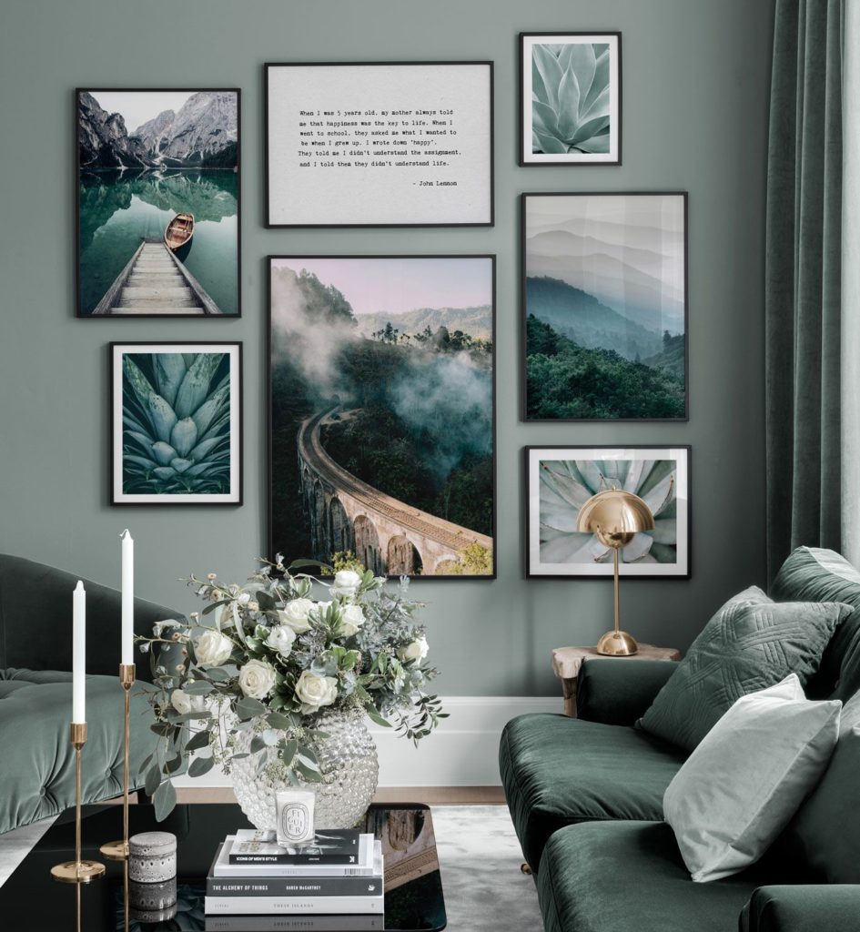
As a lot of us adapt to a newer way of working, we're looking for ways to adapt our spare rooms, create more focused environments and make changes to improve our work & life balance. Here are the changes I made to gain a great work environment in my home.
use code 'Our_London_home35' to save 35%

When the Poster Store approached me to see if we would like a hand choosing some finishing touches for our renovation, the first room which came to mind for some of their beautiful posters was my “office”. Like many, I have suddenly found myself spending more than 8 hours a day in what was previously our spare bedroom, piled up with boxes and beige walls. With another 6 months at home planned, I jumped at the opportunity to bring some style into the room. Here I show the techniques I used to bring the outdoors in. You can even use code ‘our_london_home35’ to save 35% on your own prints to spruce up your space!

With the discount code you get 35% off all posters (not ‘selection’ posters and frames). The code is not combinable with other discount campaigns on the website. The code is valid until 13th November 20.

Setting the tone of the room

Setting the tone of the room

Green is my favourite colour. Not just because it means there are no warnings or blockers as I trawl through my spreadsheets, but because it reminds me of nature. Green is calming, fresh and it is said to balance our energies and encourage growth. Perfect for the office!

I didn’t want anything too dark in this room for reasons I’ll come onto later, but I did want accents of forest, trees and leaves. Painting the main wall Card Room Green has given me the perfect base to banish the beige.

For the prints I was ordering, I knew straight away I wanted something natural and outdoorsy to compliment the colour. The ones I chose were tones of green and blue and matched the calming properties I was aiming for.

I am so happy with the prints I chose. As someone who struggles to picture the end result with any decor, I usually avoid these kinds of decisions. But being able to shop the inspiration pictures was just like when you wander around a shop which displays all the furniture in situ instead of stacked on shelves… you really can’t go wrong! View a picture wall, like it? add all to basket… done!

Light and bright
Light and bright
"Keep the room feeling fresh and bright"

There’s a reason why offices are all typically very white, with large windows and bright fluorescent lights. It keeps you motivated, stops you realising the nights are dwindling in and keeps your environment lively.

If like me you have a North facing office, choose a bright bulb with a daylight (white) tone to it.

It will also help to try not to restrict the light from the bulb too much. To help with this, I went for a birdcage style light which I picked up at a local reclamation yard. It keeps the bulb well exposed but adds some style!

It might also be a good idea to get a desk lamp to keep the space around you well lit.

Plants
Plants
"Bring the outside in!"

A number of studies have shown that incorporating plants into workplace design can also have a positive effect on perceived productivity.

Keeping plants can be very rewarding (if you’re able to keep them alive!) and indoor plants have also been shown to reduce the symptoms of “sick building syndrome” or SBS. Yes, that’s a real thing. But do you know what, they don’t need to be real for them to improve our environment. 

Keeping this in mind, I’ve brought in a fake living wall around my desk and a small propagation station for my Pothos cuttings. These are virtually impossible to kill and grow really quickly which can be nice to see. For an extra bit of relaxation, I’ll play some bird sounds through the speakers. Ultimate destress zone!

Colours, tones or textures
Adding pops of colours, tones or textures
"It's still possible to have form as well as function in an office"

When I was choosing the frames for my prints, I was torn between black and gold. The ones in the image I selected from were gold but I’m traditionally a “play it safe” kind of person. In the end, I went with the inspo photo on the website and stuck with the gold. I’m so pleased that I did. Pairing them with the green and next to a gold lamp I found on ebay has really brought out a lovely contrast and meant that the frames catch the light really well.


For transparency, my Poster Store prints were gifted to me to have in my home and discuss with my followers. This does not affect the opinions I have expressed in this article. I would not accept a gifted item I wouldn’t use or recommend to my best friend 🙂

Use code 'Our_London_home35' to save 35%

Leave a Reply

Your email address will not be published. Required fields are marked *

This site uses Akismet to reduce spam. Learn how your comment data is processed.